Historian Michel Pastoureau Presents His New Book on the Color Pink

La Gazette Drouot
Published on

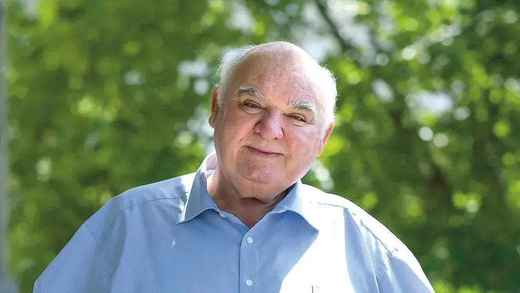
For nearly 40 years, the medievalist has been tracing the history of colors, from blue to yellow, green and red. After treating bold hues, he is now launching a new cycle focused on intermediate tones, starting with pink.

© Bénédicte Roscot
© Bénédicte Roscot

A half-color, as you call it, pink – already mentioned in your book on red – seems to open up a new cycle in your research. Can you tell us a bit more about this secondary corpus?
My original intention was to limit myself to the six principal colors. The first editorial cycle was such a success that I then decided to tackle the half-colors: pink, and in the future orange, violet, brown and gray. I was afraid that there wouldn’t be as much to say as with the other colors, but I was wrong, as is evident in this book. I won’t go beyond this current series, after which there are only shades and shades of shades, which are difficult to identify and are no longer enough to create an image, which is the very notion of color. I’m pursuing the same approach, proposing history books constructed chronologically, with a balance between the periods, limiting myself to Western Europe. Working on the history of a color involves social history and, as you can’t be an expert in everything, I didn’t want to resort to third- or fourth-hand sources. In any case, a color never comes alone, and it’s not a question of only this color: so this is a monograph in appearance only.
 

The way you tell it, the history of pink seems to be full of gaps. It doesn’t exist scientifically, it hasn’t always had a name and, finally, its perception seems modern. How have you dealt with these difficulties?
For a long time, pink didn’t have a firm name, but that doesn’t mean it didn’t exist. It is referred to in Greek and Latin through shifting terms, and you have to be very attentive when reading to find it. The term roseus, describing bright red, is a false friend, but it is found under a variety of names. Pink is a natural color, and people have always tried to imitate it: many shades of it can be found in Pompeii. The imprecision of the vocabulary is in itself an interesting point worth studying. The scientific theory suggesting that pink is not a color, as was said of black or white, I’ll leave that aside, because social practice says otherwise! Social and cultural history is distinct from the theories of physicists and chemists, and this is indeed the field I situate myself, certainly with greater ease today than 50 years ago.

Giovanni Gerolamo Savoldo (1480-1548), Saint Matthew and the Angel, 1534, New York, The Metropolitan Museum of Art.

The history of pink in modern times is better known, or at least better documented. The iconography in your latest work is more diversified: there are reproductions of artworks, objects, fashion photos and so on. What choices did you make?
I don’t offer art history books, but history books. In this respect, the works I decided to reproduce, and which I make a point of commenting on personally, tell us not only about the art of their period, but also about the context in which they were produced and perceived. For the eye, there is indeed a change in the status of the images as we move through the book, but this is due to the very materials with which I work. For the Middle Ages, I focused on miniatures and stained-glass windows: in the end, the best-preserved testimonies of ancient periods, when most of those that have come down to us are badly altered and have lost their colors. But I’m interested in the experience of color in everyday life, and that’s how, as you read on through the book, a bar of soap can rub shoulders with a Picasso. But we mustn’t be fooled on this issue: there is a real difference between the discourse on fashion – what is shown by advertising and images – and real life. You can see it in what goes on in the street: there’s a discrepancy I like to point out. Even if, from that point of view, pink isn’t doing too badly.
 

Isn’t it paradoxical that pink, which, as you say, is one of the least popular colors, should be so present and so much discussed in the public sphere?
Yes and no. All opinion polls since the 1980s have ranked pink as one of people’s least favorite colors, and it’s true that over the years the results have been the same, regardless of gender. The emphasis is always on what’s changing, but as historians, our role is also to highlight what stays the same. Blue crushes all the competition among the most popular colors; pink, on the other hand, is neglected. At the same time, and for this very reason, pink is a color that enables people to stand out, and it is used in marketing to highlight a new product, service and so on. However, I think it’s important to qualify that pink is disliked on its own. When it’s set off by white or pale gray, for example, it’s more appreciated.
 

You point out that pink has been used in different combinations over the centuries. Venetian painters used it with green; La Pompadour with blue. What can we learn from the evolution of these combinations?
It’s true: color schemes are not the same from one period to the next. Pink is staged in its relationships with colors, and different qualities or shades are highlighted in turn, to which we should pay close attention if we are to avoid anachronisms.

Édouard Manet (1832-1883), La Prune (The Plum), 1877 or 1878, Washington, National Gallery of Art.
© Bridgeman Images
Édouard Manet (1832-1883), La Prune (The Plum), 1877 or 1878, Washington, National Gallery of Art.
© Bridgeman Images

In 2017, with Une couleur ne vient jamais seule (A Color Never Comes Alone), you published your chromatic diary: a more subjective approach to colors. What do you observe about pink in your daily life?
It seems to me that pink is gradually gaining in popularity today. It’s a color that’s better received than it was ten years ago, and it’s moving in a positive direction. I’m talking here about my observations: it’s now more frequent in clothing, not just women’s clothing, and in objects. I don’t know if the success of the Barbie film alone is enough to explain why pink is better liked now, but on the street, where colors in clothing change little over time, it’s noticeable. We’ll have to wait and see what future historians have to say, but I hope they won’t give in to the rather hasty or false ideas that can be formed by leafing through magazines.
 

Your book shows that you care about your readers. What place did you give them when you were writing it?
With this collection, as with the animal collection with which I alternate, I want to produce beautiful books. The publisher plays a role in the images and layout, but I draw on my own research. My writing is based on my university career and my work on vocabulary, clothing and painting. Scientific articles are invisible to the general public, but without all this preliminary work, there would be no books today. The first volumes of this series on color have now been translated into around thirty languages, and while I reread those in languages I know, I also let the books live their own lives. The translation into Japanese was a special moment, with a view of Western culture that found its relevance abroad.

Worth Knowing
Michel Pastoureau, Pink, The History of a Color, Seuil, 192 pages, €39.90.

More in the auction industry